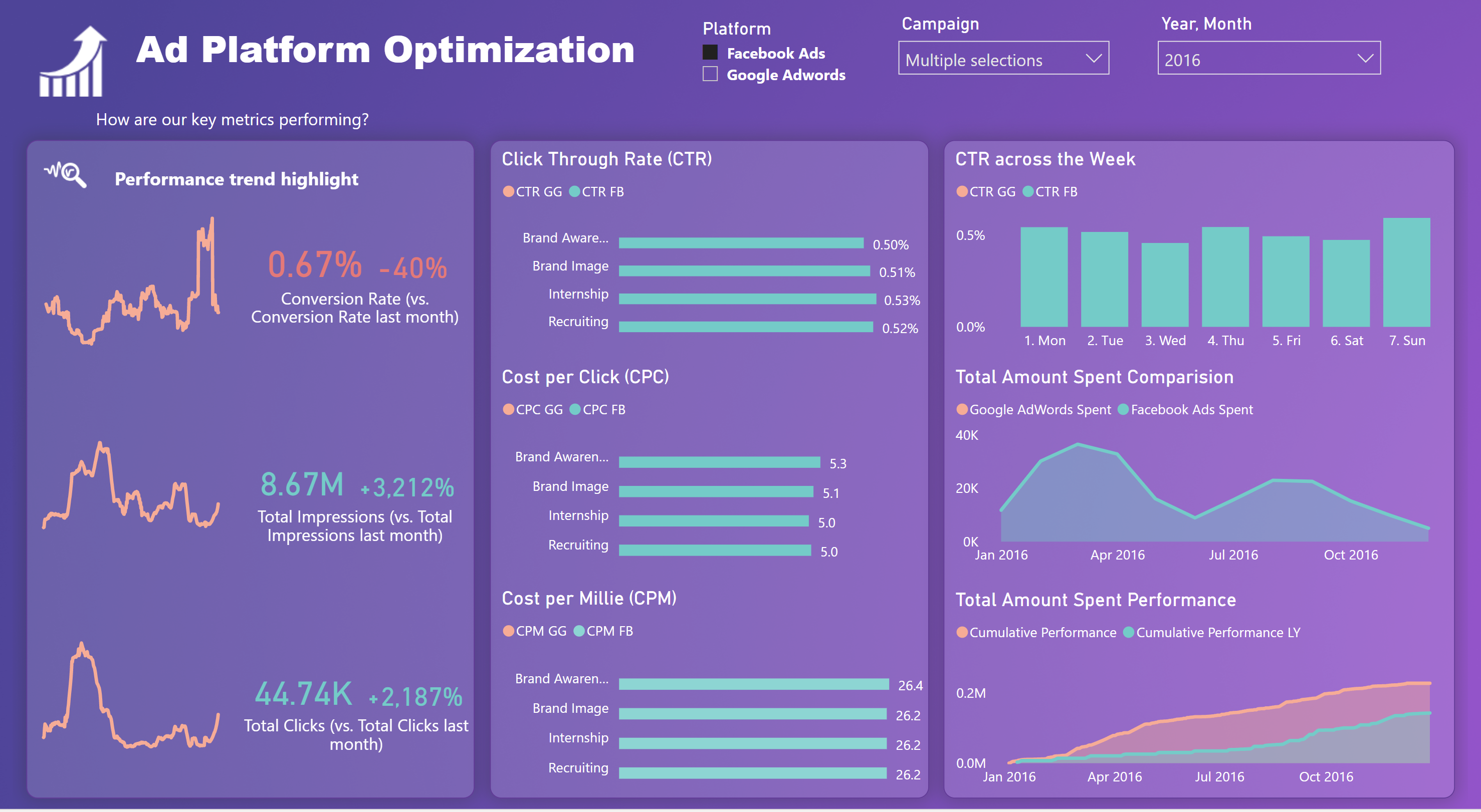
Interactive dashboard in Power BI showing comparison of two advertising platform performance
I am interested in leveraging key advertising metrics in marketing to monitor the amount spent and analyze the conversion rate of different campaigns so I decided to practice creating an interactive dashboard in Power BI.
The data is obtained from Sisense. you can view a whole dashboard here
I was so amazed by how easy and simple it is to create interactive dashboard with Power BI and looked for insights easily by choosing different slicers to observing the changes
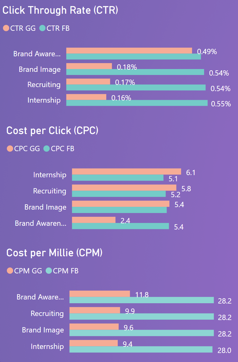
In my project, I observe some key interesting differences between 3 key metrics in this dataset:
CTR of Facebook is higher than Google and the conversion rate for Google Ads is higher than that of Facebook Ads in both years
Cost per mille (cost to acquire a thousand of clicks and impressions) of Facebook is higher than Google (nearly double) since they spent a large amount of money in the 4 campaigns (Facebook is 10 times the Google spent)
Only the cost per click, Google is higher than Facebook

Key insights I learnt after finishing this projects:
The very best Facebook ads blend in seamlessly with the videos, images, and other visual content in users’ News Feeds so Facebook has an incredibly high interaction metrics like impression and reach.
On the other hand, Google also its own advantage in its immense reach, which therefore leads to the high conversion rate in clicks.
So what's next?
Through some key findings, the marketer should consider investing more on Google Ads if their main concern is to get more clicks to the website, otherwise if they target to get more impressions, Facebook Ads is more helpful.


